Fresh from the 2012 MVP summit with lots of enthusiasm and grand ideas, I thought it would be worthwhile repeating my 25 illustrated examples of Visual Studio 2010 and .NET 4 post with the technologies of today (or should that be tomorrow?) albeit a few weeks later than I had planned. There are some very, very exciting new things in the pipeline which I’d like to share while they’re fresh in my mind and analogous with that post from two and a half years back, I’d like to actually show you what’s happening.
There’s so much great new stuff in Visual Studio 2012 that it deserves its own post! If I can create the time, I’ll also try and get around to covering ASP.NET specifically. Keeping in mind I’m a very web-centric guy, let me show you some of the features which have gotten me a bit excited about what’s coming in the very near future.
1. Its grey (and other UX changes)
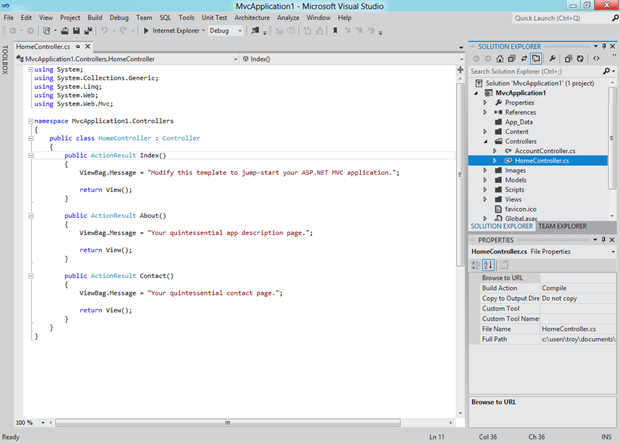
Let’s just get this out there right now; the new Visual Studio UX is polarising. Actually, polarising would suggest there are two different views of it. The reality is there is a strong chorus of “Ugh” at the moment. You see it’s all about Metro these days and that means VS 2012 now looks like this when running on Windows 8:
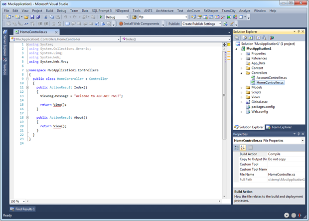
Just in case you need a little reminder of how things used to look, here’s VS 2010 on Win 7:
There are three things I want to call out in VS 2012 as they’re the three which are repeatedly brought up:
The greyness.
The capitals on panel titles.
The colons on the panels.
You can get a better idea of those last two items here:
Read more: DZone
QR: 


0 comments:
Post a Comment